28 April 2023
Song of the day: Thirteen Silver Dollars.
A realization has snuck up on me unawares, overbrewn and sour, which is that CSS nearly always makes websites harder to read, rather than the reverse. Let us select a subject — is it not hideous? The cookie banner wafting up from the screen-bed, the shorn-off block of black-on-white floating vaguely beside the advertisement-column, everywhere hemmed in by senseless clutter.
Now that you've seen the evil, let us stay its hand for a spell — cast off those wretched glamours, aye, and show me the truth of it.
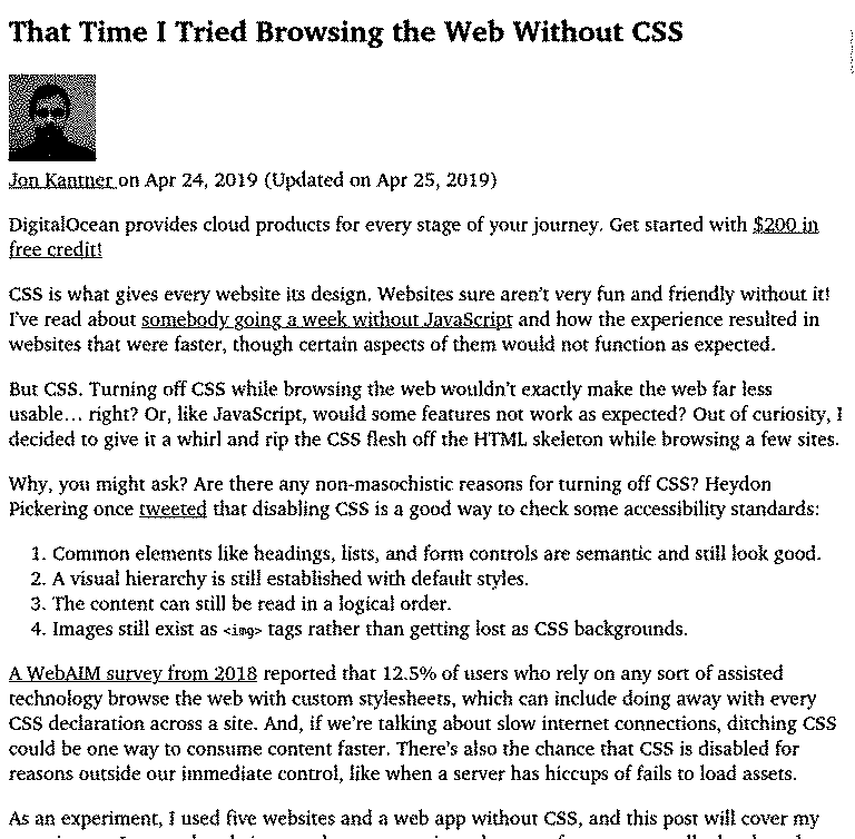
Blue on black on white, left-to-right and top-to-bottom. Nothing leaps out from the side of the monitor to startle and distract, nothing draws the eye away from the words underneath; hell, it even scrolls faster! And this is an evangelist, a stylist-priest, learned in the nooks and crannies of the Web. The default line-height is perfectly legible. The default line-length may be foiled through the burdensome business of changing the browser's window-size.
Yes, though I've a small screen to begin with and trim it down further with Tree Style Tabs, so never really run into the issue.
God no.
— NSDoM —